Data Academy is Mydral’s training division with over 10 years of experience in the field. Our expertise is structured around our customers’ projects as the value of utilizing data is now a priority to take their business to a next level of success.
Mydral Data Academy offers the best sources for building and empowering competencies around data prep and data vizualisation to transform your business. We help you to easily explore and analyse your data. Are you ready ?


Complete training
for all
skills levels

+4000 certified
Data analysts/
scientists

Learn from our data experts

Best practices
Tips & tricks

FR & EN

Online courses
Your learning data journey starts here !
Why Data Academy ? Just learn from data-driven experts ! We provide a multi-course training program with the business solutions: TABLEAU & KNIME featuring a large portfolio of courses to become the best data experts.
Our wide range of courses provide basic knowledge, key features and will confirm your professional expertise. The scope of training isvtailored to your organisation’s needs.
With Mydral Data Academy, train with the best ! You will get the technical skills to help transform your business.


TABLEAU ESSENTIAL

This module is intended for everyone in the company who is will use Tableau Software. It allows the user tocarry out analyses and navigate in thesolution but also to manipulate andcreate his reports himself.
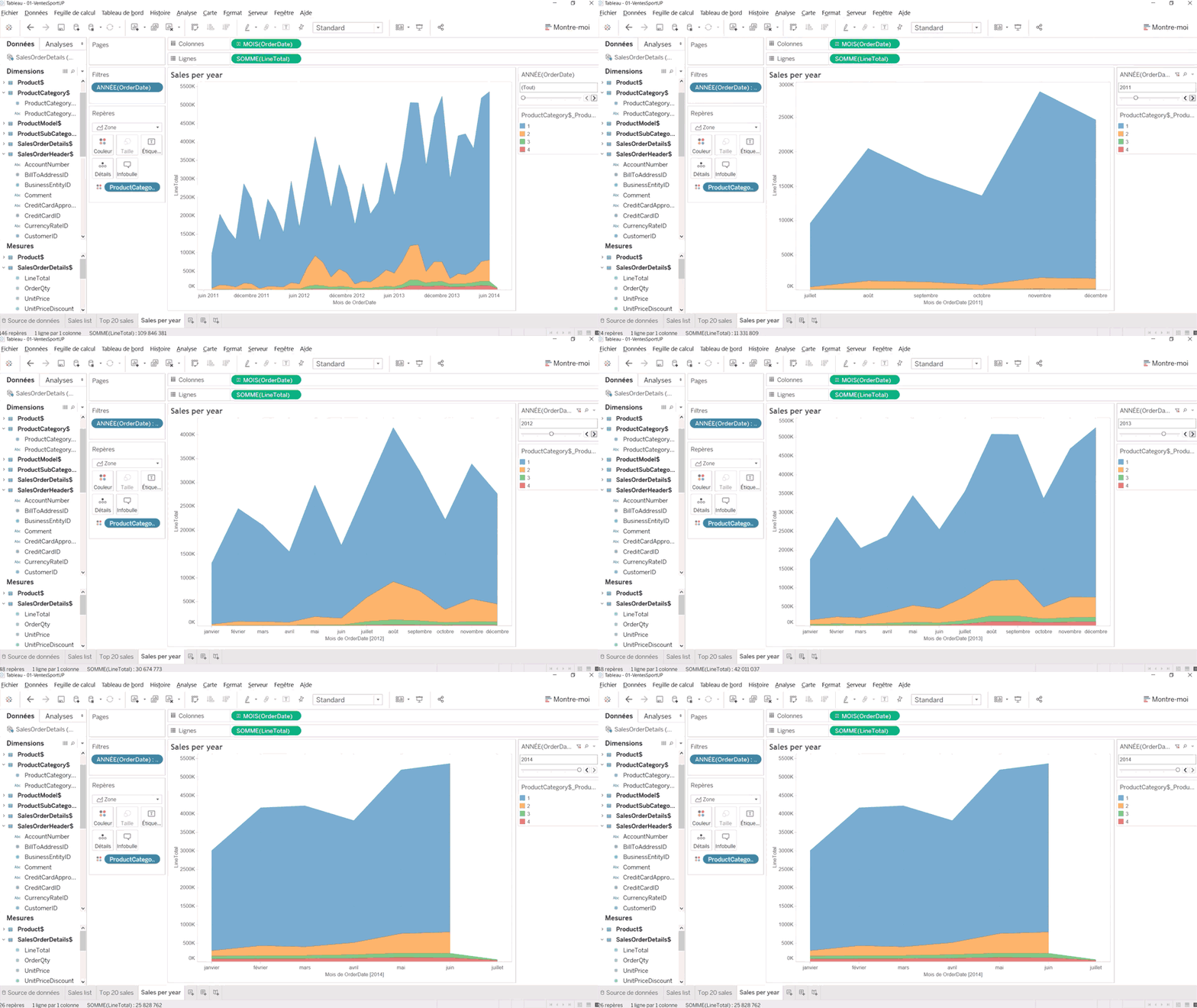
DATA MANAGEMENT AND BASIC PRINCIPLES
To better understand how Tableau Software works, you need to know how to work with its basic concepts. This section will provide users with the following practical aspects:
- Management of dimensions and measures
• Drag and drop
• Principles of graphic representations
• Grouping of data
BASIC FUNCTIONS AND FILTERING METHODS
This section will allow you to learn the different features of Tableau Software, and
understand the filtering techniques for deeper analysis.
- Aggregation of measures
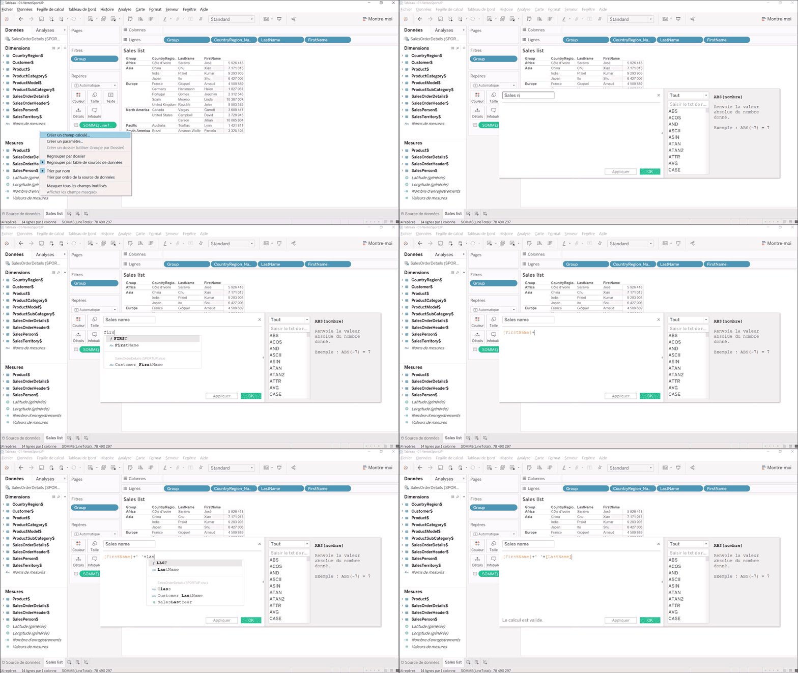
• Use of calculated fields
• Use of hierarchies
• Filtering in tables or graphs
USE OF “SHOW ME”
This section will teach how to automatically detect the most appropriate type of graph for your data:
- Principles of graphic representations
• Using the “Show me” assistant
PERSONALIZATION
Users will learn how to create different customizations with Tableau Software. Thefollowing concepts will be covered:
- Data format
- Fonts and colors
- Adding texts or labels
- Zoom / Drill down
EXPORT
Different methods of exporting data and sharing dashboards:
• Dashboarding
• Workbook package (.twbx)
• Other formats: PDF, XLS, PPT
Fr | En - 1D
↓

TABLEAU ADVANCED FUNCTIONS

This module is intended for everyone in the company who builds reports in Tableau Software. It addresses how to use data from various sources, and offers different methods of personalisation and optimisation.
IMPORT AND HANDLING OF DATA
This section consists of importing data into Tableau Software from various sources, andmastering the different ways of working with them:
- Excel connections, Access databases, flat files, and web page content
- Transformation of measures into dimension
- Manipulation of geographic and temporal Data
HANDLING OF FIELDS AND ADVANCED FUNCTIONS
This section allows you to understand the different ways of working with different data fields and to familiarise yourself with advanced calculation and analysis features:
- Edit / sort content
- Customisation of data formats
- Aggregations (sum, average, number, etc.)
- Quick table calculations (growth rate,% of total, ranking…)
- Trend curves and forecasts
- Use of calculated fields and parameters
ANALYSIS OPTIMISATION
Here we will look at different techniques for optimising analyses on Tableau applications:
- Selection on a report
- Temporal dimensions
- Creation of hierarchies
GRAPHIC OPTIMISATION
Users will learn how to optimise various graphic representations by using calculated fields function offered by Tableau Software.
FINALIZATION AND DASHBOARDING
The training ends with two modules on data sharing.
- Storytelling and Data Journalism
- The creation of advanced dashboards (filters, action… etc)
- Mobile layout
Fr | En - 2D
↓
↓
↓

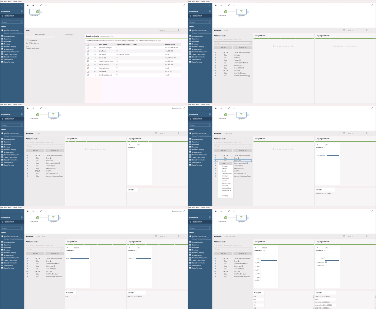
TABLEAU PREP

Aimed at all people in the company who might need to use Tableau PREP. This training allows you to recreate your company’s business processes digitally, but also to connect to any data source. Results can be directly stored in native Tableau data formats.
IMPORTING DATA
In this section, users will learn how to import data from an EXCEL file:
- Exploring the interface
- Import of data
- Process documentation
BASIC PRINCIPLES
To better understand how Tableau PREP works, it is necessary to know how to manipulate its concepts. This section will provide the user with the ability to:
- Filter the results
- Perform calculations
- Clean the data
DATA ENRICHMENT
In this section, you will familiarise yourself with the concept of how to join your data in order to enrich your formatting data. You will learn:
- How to join
- Data preparation and formatting
TREATMENT
In order to support the sometimes tedious step of documentation, we will learn how to format and describe each process:
- Concept of commenting
DATA EXPORTING
In this section, users will browse the different solutions for exporting data into different formats:
- Data Extract table
- Hyper
- Tableau Server
Fr | En - 1D

TABLEAU GOOD VIZ

When it comes to presenting numbers, it is as important to display accurate information as it is to show it well. This module will help you improve the ergonomics and the presentation of your Tableau Software applications using good visualisation techniques.
GRAPHICAL PRINCIPLES
This section focuses on laying the foundations of visualisation techniques. The key points of graphic representations are addressed:
- Principles of visual perception
- Management of graphic charts
- Presentation of concepts / proportions
USE OF GRAPHIC THEMES
With Tableau Software, you can use graphic themes and apply corporate graphics. This module explains how to take advantage of these charters in Tableau Software.
PLACEMENT OF OBJECTS
This module gives the trainee best practices for the layout of navigation, display or analysis objects within a Tableau Software tab.
SCREEN SEGMENTATION AND BANNERS
In screen design, it is important to distinguish banners from screen areas that are used for navigation and rendering of analysis results. This section presents best practices in this area.
USE OF FONTS AND COLOURS
For an application to be pleasant for the user, a certain harmony of colors and fonts is required. An overly glossy application can scare a corporate audience and overly high contrasts can cause migraines. This section provides the trainee with the latest university research techniques on human vision and perception.
MISE EN SCÈNE
Much like in the cinema, a Tableau Software application must tell a story, with a beginning, a middle and an end. Cinematographic techniques are used here to improve the presentation (storytelling, scripting & introduction to Data Journalism for business).
Fr | En - 1D

TABLEAU EXPLORER

This module is intended for everyone in the company who reports in Tableau Software. In particular, it discusses how to use data from various sources, and offers different methods of personalisation and optimisation. This module will end with a course on publishing data on a server.

DATA MANAGEMENT AND BASIC PRINCIPLES
Pour mieux comprendre comment fonctionne Tableau Software, il est nécessaire de manipuler les concepts de base de l’outil. Cette section apportera à l’utilisateur les aspects pratiques suivants :
- Le Glisser-déposer
- Regroupement de données
- Principes de représentations graphiques
- Gestion des dimensions et mesures
FONCTIONS DE BASE ET MÉTHODES DE FILTRAGE
Cette section permettra d’apprendre à se familiariser avec les différentes fonctions de Tableau Software, et d’appréhender les techniques de filtrage afin d’approfondir l’analyse.
- Agrégation de mesures
- Utilisation de champs calculés
- Utilisation des hiérarchies
- Filtrage dans les tableaux ou les graphiques
UTILISATION DU « Montre moi »
Cette section vous permettra d’apprendre à détecter automatiquement le type de graphique le plus approprié à vos données:
- Principes de représentations graphiques
- Utilisation de l’assistant « Montre moi »
PERSONNALISATION
Les utilisateurs apprendront à effectuer différentes personnalisations avec Tableau Software. Les notions suivantes seront abordées :
- Format des données
- Polices et couleurs
- Ajout de textes ou libellés
- Zoom/Drill down
EXPORT
Les différentes méthodes d’export de données et partage des tableaux de bords :
- Dashboarding
- Package Workbook (.twbx)
- Autres formats : PDF, XLS
Fr | En - 1D
↓
↓

TABLEAU SERVER

This module is intended for everyone in the company who reports in Tableau Software. In particular, it discusses how to use data from various sources, and offers different methods of personalisation and optimisation. This module will end with a course on publishing data on a server.
PRINCIPLE OF TECHNICAL
ARCHITECTURE
This first section validates the technical prerequisites for installation and architecture. The trainee will learn to reconcile hardware and software architectures using the Tableau Software Server compatibility grid.
LICENCE MANAGEMENT
Once the installation is complete, the trainee will manage the licenses at the server level. All license levels will be explained.
SECURITY
All security issues are covered in this section:
- Local Security
- Directory security
INSTALLATION
This section will address the installation of Tableau Software components.
SETTING THE CONTROL PANEL
The Tableau Software server control panel is used to control the behaviour of the server. In this module, the trainee will learn to administer the following aspects of the server:
- User Management
- Configuration of document directories
- Configuration of publication directories
- Printing configuration
PERFORMANCE MANAGEMENT
This section covers the basics of tuning to better manage performance.
- Using Windows performance monitor
- Server cache details
- CPU usage
- Use of server memory
Fr | En - 1D

SPECIAL CHARTS

These modules, via exercises and guided solutions, will assist you in creating sophisticated, elaborate, or even complex graphics, intended for a most informed audience – the “data savvy” people. These charts will therefore help you translate your datasets into highly graphic, colorful and interactive representations that will answer many of your questions.
THE DONUT CHART
The Donut is an improved version of a Pie Chart which makes it possible to display additional information – while keeping the sense of distribution within a performance indicator.
THE FLOW MAP
The Connection Map is used to show relationships on value migrations. This shows how the migration is distributed geographically.
THE BUMP CHART
Allows you to easily see the evolution and classification of different categories within a specified timeframe.
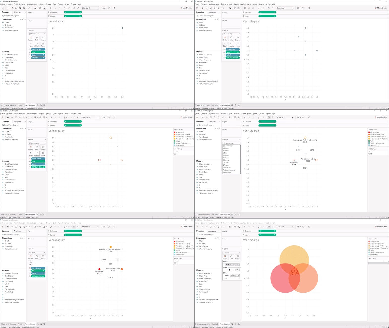
THE VENN DIAGRAM
Displays – in a very visual way – possible logical relationships between several data sets, each represented in a circle. This allows you to view the distribution of additional sales.
THE SANKEY DIAGRAM
Offers the possibility of visually understanding transfers and flows between several dimensions, in order to show a flow through a system. Instead of creating 2 or even 3 different graphics, here, we can visualise a flow in several dimensions
Fr | En - 1D


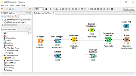
KNIME ESSENTIAL

Intended for everyone in the company who might use Knime. This training allows you to recreate the business processes of your company digitally, but also to connect to any data source. The results can be directly stored in the native Table (TDE) or Hyper data format.
DATA IMPORT
In this section, users will learn how to import data from an EXCEL file:
- Exploring the interface
- Import of data
- Process documentation
BASIC PRINCIPLES
To better know and understand how Knime works, it is necessary to manipulate its concepts. This section will provide the user with the ability to:
- Sort results
- Filter results
- Perform calculations
- Clean the data
PROCESSING FLOW FORMATION
In order to improve the sometimes tedious step of documentation, we will see how to format and describe each process with Knime.
- Commentary
- Annotations / metanode
PROCESSING FLOW FORMATION
In this section, you will familiarise yourself with the concept of how to join your data in order to enrich your formatting data. You will learn:
- To join
- Data preparation and formatting
- Date formatting box
DATA EXPORT
In this section, users will browse through different data export solutions:
- Towards different formats
- With various options (rewrite the file, incremental, etc.)
Fr | En - 1D
↓

KNIME ADVANCED FUNCTIONS

Intended for everyone in the company who might use Knime. This training allows you to recreate your company’s business processes digitally and to connect to any data source.
DATA IMPORT
In this section, you will learn how to import data:
- From files
- From the web (using web services) And manage the paths via the “Workflow Dependencies”
DATA CLEANING
To better understand how Knime works, it is necessary to manipulate its concepts. This section will show you the basics of data cleaning:
- Dynamic renaming
- Data Cleansing
- Advanced formulas (If, left, regex…)
DATA ENRICHMENT
In order to cross-analyse your analyses, in this section you will work on analytical enrichment techniques:
- Multiple joins
- Cross Tab / Transpose
- Generate rows
- Distance calculation (Geo spatial)
USE OF MACROS
Knime metanodes allow you to encapsulate, simplify and modularise your visualisations. In this section, you will learn about the various functions of the interface menu:
- Buckle
- Flow variable
- Widget
EXPORT/PUBLICATION
In this section, you will go through different data export solutions:
- To different formats
- You will also learn to:
- Publish a workflow on the server
- Automate / Plan its execution
Fr | En - 2D

KNIME OVERVIEW

Intended for everyone in the company who might use Knime. This training allows you to recreate your company’s business processes digitally, and to connect to any data source.
PRESENTATION OF KNIME
Presentation of the system & operation KNIME installation Exploring the KNIME interface Overview of the “Next Best Offer” workflow
I/O DATA MANAGEMENT
Use Nodes / Streams Integration of flat files
- Connection to databases
- Using Write File Nodes
- I/O management of Write / Update databases
- 1st step in setting up Reporting
DATA AGREGATION
- Handle transformation / cleaning nodes
- Aggregation (Group By)
- Data integration
- Using joins
DATA VIZ/DATA MINING
- Using visualisation nodes
- 1st step in interactivity
- Interactive visualisation nodes
- Example: using R graphics
- Generation of a Visual Query
- Optimise settings
- Cross Validation
KNIME INTEGRATION
- Integration with third-party tools:
- Languages (Java, Python, R)
- Web services
- JSON Path / XPath
- Big Data (Hive, HDFS, Spark)
- H2O integrations
Fr | En - 2D
↓
↓

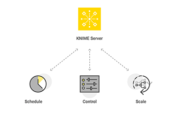
KNIME SERVER

Intended for everyone in the
company who might use Knime.
This training allows you to recreate your company’s business processes digitally and to connect to any data source.
PRODUCT OVERVIEW
- KNIME Analytics Platform
- KNIME Server (Small, Medium, Large)
- Connection to KNIME Server from the client
- Server Space as Shared Repository
DATA SCIENCE PROJECTS
Participants in the project:
- Data Scientists
- Business Analysts
- IT Administrators
- Customer segmentation use cases
- Basic workflow for customer segmentation
- Final workflow with menus and buttons on WebPortal
KNIME WEB PORTAL
- WebPortal page
- Workflow Jobs
- Detail Pane
- Inspect a KNIME Server Workflow
- Move & Execute Workflow on Server
LICENCE, CUSTOMISATION, ACESS, VERSIONING, API
- Log Files, Installer & License Distribution
- Versioning, Backups, and Rollback
- User Authentication & Right of Access
- WebPortal Templates
- Admin Portal
- Access to the Webservice (REST)
CREATE A WORKFLOW WEB PORTAL
- Log Files, Installer & License Distribution
- Versioning, Backups, and Rollback
- User Authentication & Right of Access
- WebPortal Templates
- Admin Portal
- Access to the Webservice (REST)
Fr | En - 1D

KNIME DATA MODEL

Intended for everyone in the company who may use Knime. This training allows you to recreate your company’s business processes digitally, and to connect to any data source.
PRINCIPLES OF MODELING
- Data presentation
- Why data modeling?
- Determine management facts
- Organisation of dimensions
- temporal hierarchy, geographic location, product hierarchy, Preparation of measures ,
- Aggregation
ANALYTICAL MODELING
The relational model
- Primary key
- Foreign key
The decision-making model
- Star model
- Snowflake pattern
DATA OPERATIONS
Joins:
- Right join
- Left join
- Inner join
- Full join
- Union
HOLLOW TABLE
Presentation
- Advantages
- Disadvantages
- De-normalised fact tables
- Data Lake principle
- Use of Datamart
USE CASE
In this section, through the Sport Up business use case (budget analysis, actual, order, sales) you will carry out a complete data modelling in order to meet relevant analysis needs
- Budget development, sales monitoring
KPIs…
Fr | En - 1D


TÉLÉCHARGER LE CATALOGUE COMPLET


TÉLÉCHARGER LE CATALOGUE COMPLET

EXPLORE THE FULL CATALOG OF COURSES
You haven’t yet taken advantage of our various offers ? Questions ? Take a close look to the catalog and for more information on the courses, fill in the form below to contact us and select your training program !


